Websites · restaurant websites
What the best website for a restaurant actually does
Nearly everybody arriving at a restaurant website wants one of four things: the menu, the hours, the address, or a table. Most of them are on a phone and a good number are already standing outside somewhere deciding. The restaurant that answers all four in one screen takes the booking from the one that made them hunt.
Here is what that looks like in practice, and the one mistake that costs the most.
The menu must be text on the page
A menu as a PDF is the single most expensive mistake a restaurant website makes. It is slow on a phone, it usually opens at the wrong zoom, it cannot be read by a search engine, and it is invisible to the answer engines people increasingly ask for a recommendation. A dish with a price, written as text on the page, can be found by somebody searching for that dish in your town. The same dish inside a PDF cannot.
Write the menu out, with prices, and update it in place. If it changes weekly, that is an argument for a site you can edit yourself in a minute, not an argument for a PDF.
The four things, in one screen
Reachable without scrolling and without a menu tap:
- Today's opening hours, and the days you are closed
- The address, as text a map can read, with the nearest station or the parking
- A booking route, whether that is your reservation system or the phone number
- The menu, or a link to it that lands on text and not a download
Photograph the room, not only the plates
Food photography sells the dish. Room photography sells the evening, and the evening is what people are choosing between. A person deciding where to take somebody for a birthday is trying to picture the table they will be sitting at, how loud it is, and whether it is the sort of place that suits the occasion.
Shoot the room with people in it, at the light level you actually run. A bright empty dining room at three in the afternoon tells a customer nothing about eight in the evening.
Answer the questions that come by phone
Every restaurant has a list of questions staff answer on the phone all day. Do you have vegan options, can you do gluten free, do you take children, is there a set menu at Christmas, do you have a private room, is there step-free access, can we bring a cake. Each of those on the page is a phone call your staff do not take during service.
It is also how a search engine or an assistant decides you are the answer to a specific question. Nobody wins the query about a private dining room for twelve by writing that they have a warm and welcoming atmosphere.
Bookings you actually control
Whether you use a reservation platform or take bookings by phone, the site should be the thing sending the booking, not a portal. Every table booked through your own page is a table you did not pay a commission on, and the only reason a customer uses the portal instead is usually that the restaurant's own site made it harder.
Put the booking link in the first screen, in the header, and again at the bottom of the menu, which is where somebody has just decided.
What it should cost
A restaurant site is not a one-off build, because the menu changes and the hours change and the Christmas booking page comes round every year. Paying an agency for each edit is how restaurants end up with a menu from two summers ago on their site.
These decks are finished restaurant sites you fill in yourself: your dishes, your prices, your hours, your photographs, live on a real address in under a minute and free for the first seven days. Changing Tuesday's menu is a form, not an invoice, and the hosting is included in the monthly price.
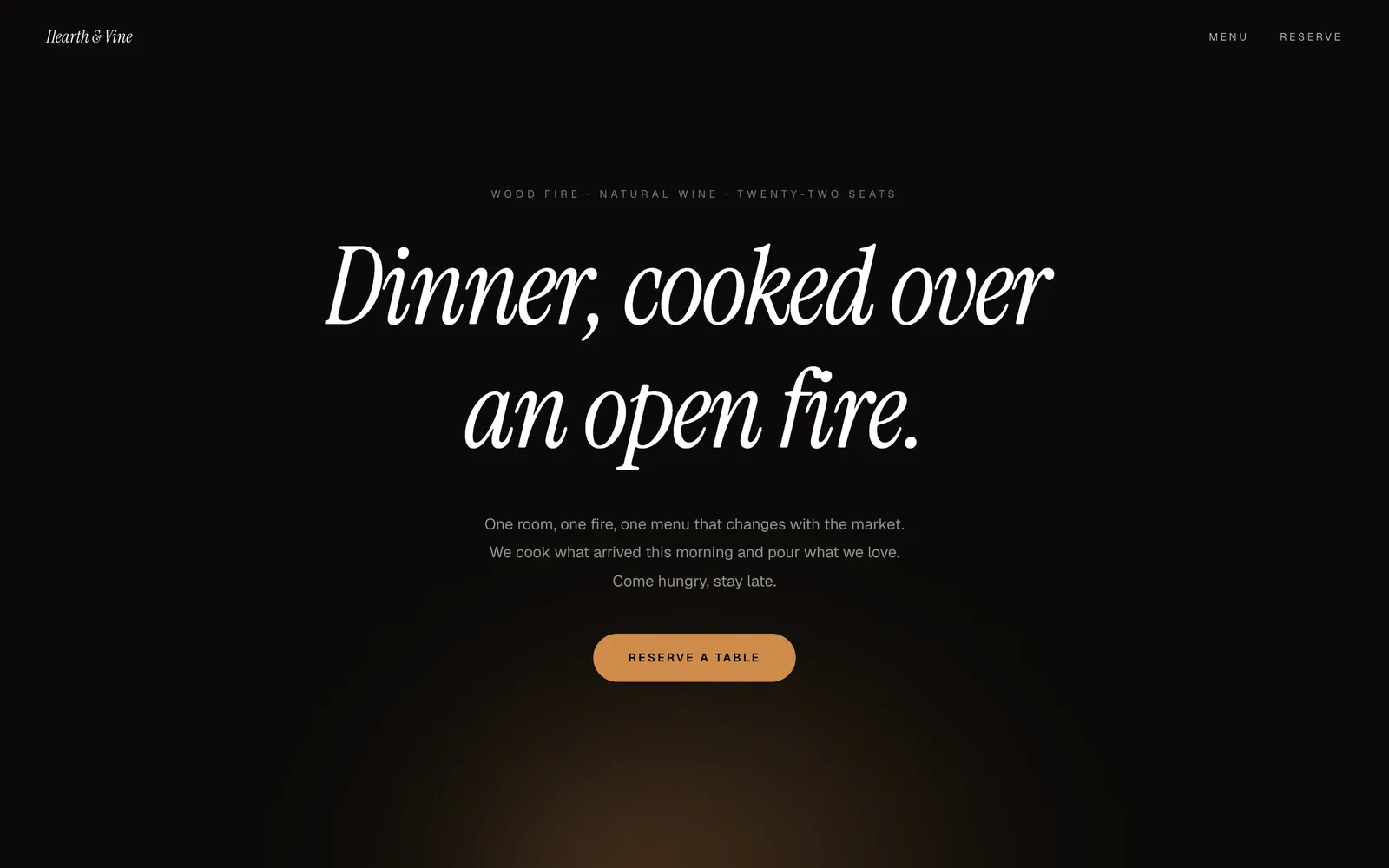
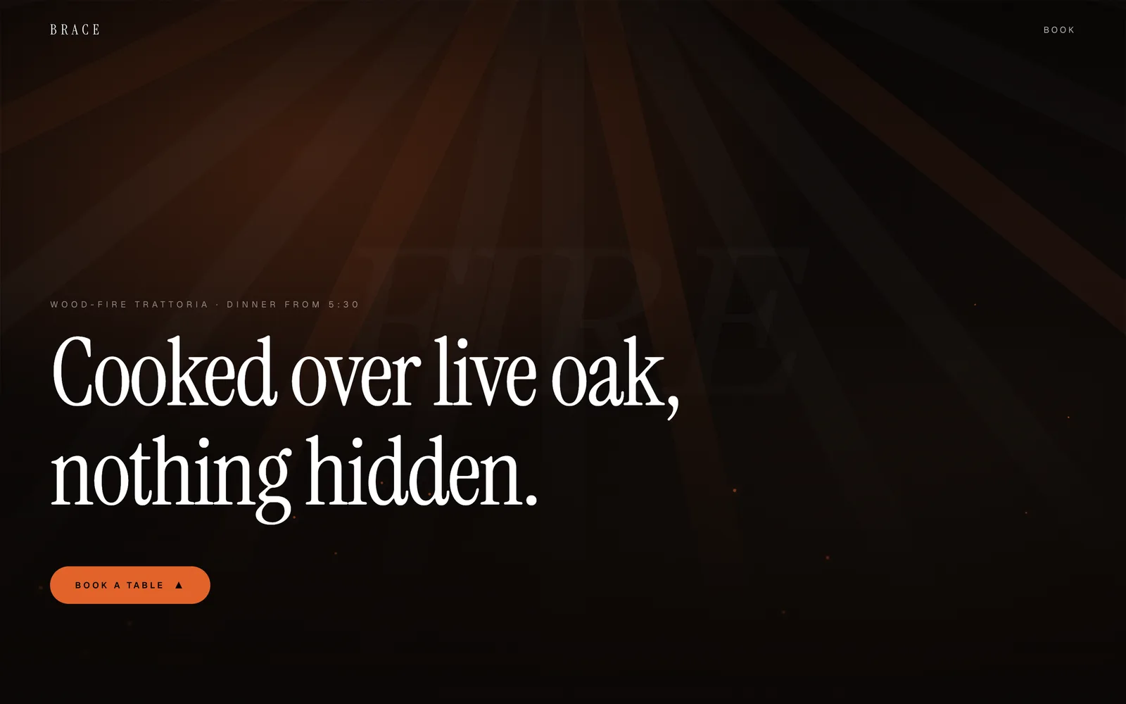
Two you can look at right now
Both of these are running sites rather than pictures of sites. Open one, then put your own name, words and pictures into it: that takes under a minute and it is free for the first 7 days. From $9.99 a month to keep it, hosting included.
Questions people ask first
Should a restaurant menu be a PDF?
No. A PDF is slow on a phone, cannot be read by search engines and is invisible to assistants recommending places to eat. Write the menu as text on the page, with prices.
What should be on a restaurant home page?
Hours, address, a booking route and the menu, all reachable in the first screen, then photographs of the room as it actually looks in service.
Is a website worth it when we are already on booking portals?
Every table booked through your own page avoids the portal's commission. The portals win when the restaurant's own site is harder to use than theirs.